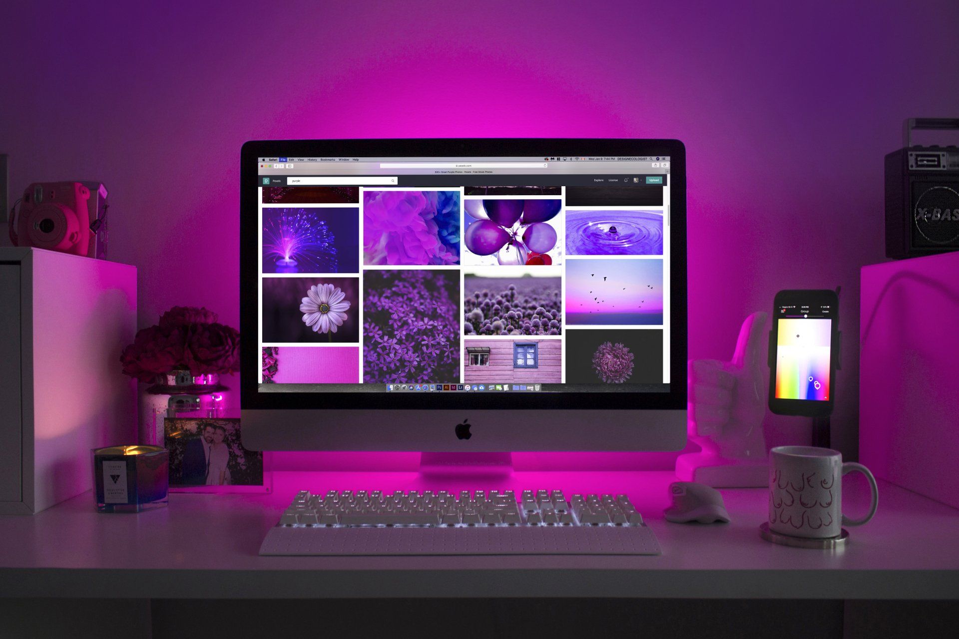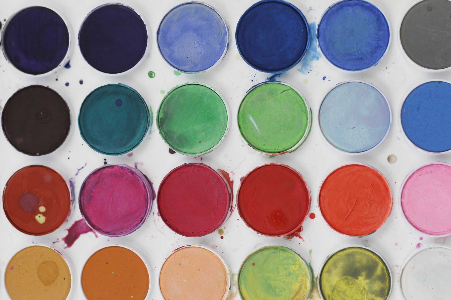
It is common for websites to have vibrant and colorful pages in an effort to impress their visitors. However, this approach often falls short of producing the desired outcome. Effective web design requires a harmonious blend of colors and negative space, as outlined below.
What Is Negative Space?
When people use the term
negative space
in art, they mean the space between and around two objects of an image. We use it in a similar way when we talk about web design.
Negative space is any unused space on a website page. You may have heard it as white space, but it means the same thing. Another definition could be that negative space is anything that does not catch the users' attention. If we use the second definition, negative space does not have to be white space but can be a background, an image, or a color.
Negative space has only two elements that are known as micro and macro. The micro negative space includes any space between small elements like letters, words, and lines. Macro negative space is space between bigger elements. Both micro and macro negative space are important when we build a website.
How To Use Negative Space
Use Negative Space To Break Up Your Pages
Websites that are saturated with information and lack adequate spacing can be overwhelming for visitors. It becomes difficult for them to comprehend the various components of the website. Negative space, however, can be used by web designers to create a visual break between the components and information on the website. This allows visitors to focus on one component at a time and better perceive the information. It's important to ensure that there is equal spacing between each component to establish a great website structure.
Improve Readability
Negative space helps the visitors to read the content of your posts and pages. There is negative space between words and paragraphs that make the content easier to read. Good readability can improve the performance of every part of your website. It will generate more conversions, attract more visitors, and increase engagement rates.
Create Visual Hierarchy
Achieving a balance between color and negative space is crucial for web designers to establish a visual hierarchy. This approach helps emphasize the key elements of your website and directs visitors to the appropriate pages. Additionally, it's impossible to create an efficient website layout without proper spacing between various elements.
Direct the flow of a page.
When you visit a landing page, you expect to see the headline, and then there is some content or call to action. If you scroll down, you will see more content, images, and calls to action. We need to make good use of negative space to direct the flow of the page. This process will help the website owners to get more conversions and the visitors to get the information they want.
Conclusion
While colors are important on any website, you need a great use of the negative space to keep a balance. If you use too much color or too much negative space, it can harm the user experience.